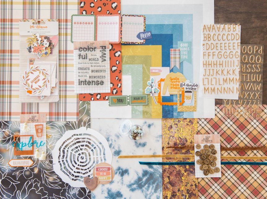
Hello everyone. Master Forger Misty is sharing their takes on mini kits using our inspiration for the month. Mini kits are great if you want quick projects, or if ideas are sparked by just small bits of the inspiration. Whatever your reasons for approaching mini kits, and Misty is here to help get you creating.

So let's see where Misty went with her projects.
Master Forger Misty has this to say about her process.
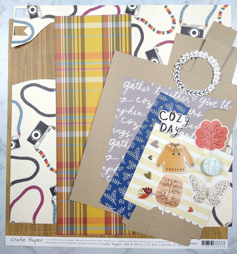
When I was pondering this project I was in the process of cleaning my scrap space. While doing that I came across this bin that contained the extra photos, paper scraps and previous fall themed layout I had created a couple of month back.
Admittedly this gave me a huge head start on creating a page kit for this month's mini. If you think I cheated, I promise all you would need to do to get to this same point is choose a base pattern paper or cardstock, plus 3-4 pattern paper scraps in various sizes. Then grab 6-10 embellishment pieces in various sizes to support your theme and you are done. Simple as that. Really.
Here I chose a base woodgrain paper, 5 pattern paper scraps, 1 cardstock and literally 12 individual embellishment pieces. The woodgrain, plaid and use of blue comes from our inspiration piece. The other imagery I chose to support my page theme (cameras + together/cozy)

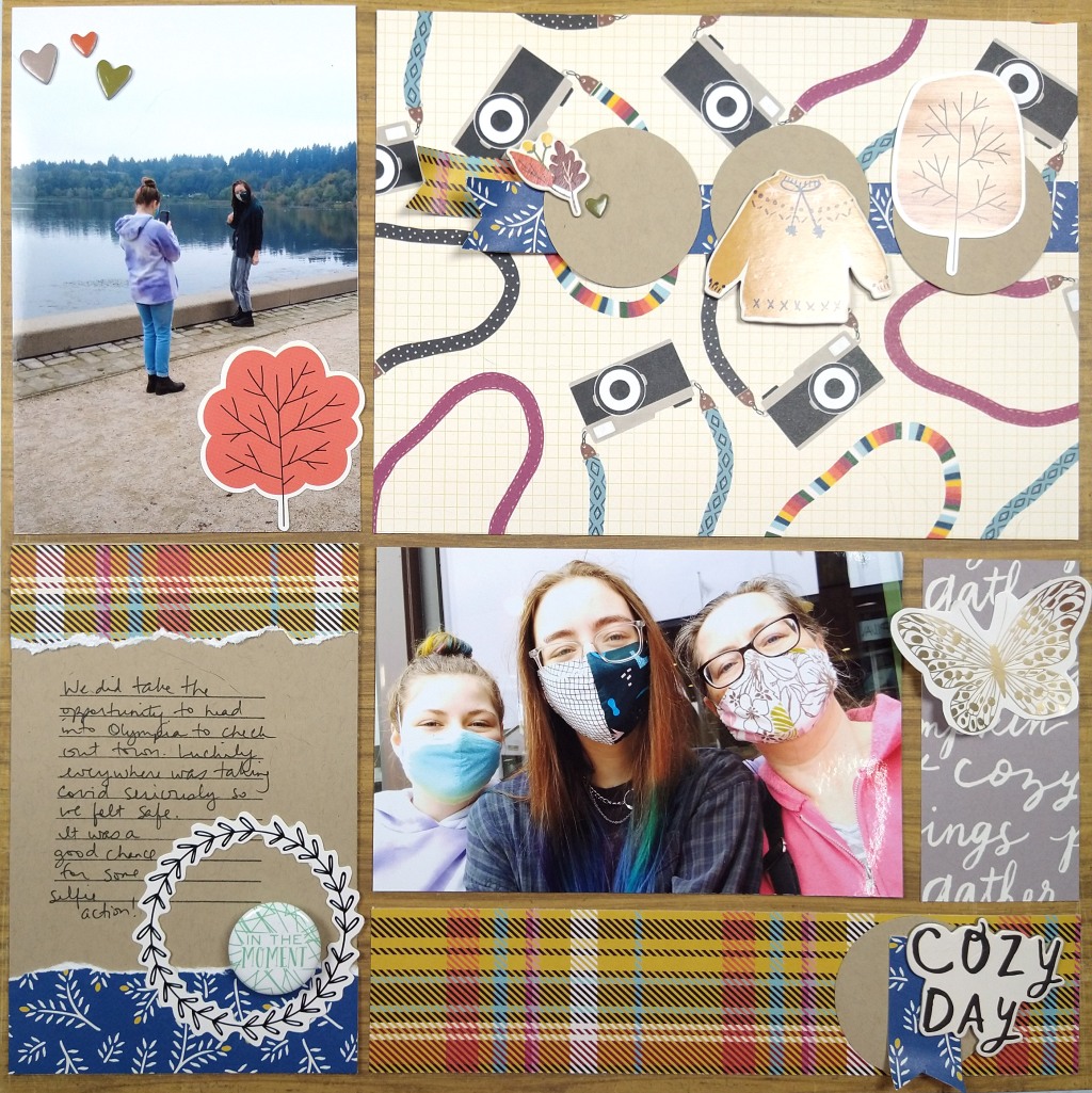
Once I had a narrow palette of supplies to work with, my layout came together quickly. I think about this style of layout as a "pocket page" layout without the actual pockets. (You could also just call it a grid layout). I love the idea of pocket pages for ease but I feel too constrained by the pocket numbers and orientations. So I started my layout with the base page + photos. I trimmed my photos, and in fact all the pocket elements, down by 1/4" in both height and width to give that gap that pockets have.
The open areas around the photos now become other "pockets." The top right was very large and could have been broken down into several pockets, but I left it large for more visual impact to those cameras since this layout is about selfies. The journal pocket on the bottom left is 6x4" (or rather 5.75x3.75" once trimmed down.) The gray strip started at 2x4" before trimming and the lower plaid is 2x8" before trimming.
Sprucing up each pocket with limited embellishments helps the whole page feel cohesive. I also repeat elements, such as circles, blue, and plaid, in a visual triangle to pull everything together. Approaching a layout this way is super straightforward. It gives you the ease of pocket pages without the constraints. And with this design you could include way more photos than I did! Just so much flexibility here.

I hope you were inspired by how easy it can be to put together a quick page kit as well as a quick layout! If you'd like to see this process in video you can check out the YouTube episode.
The rest of September is going to look something like this:
- 12th & 18th September: Challenges #1 & #2 - to inspire you to get creating from your own kit
- 24th September: Follower Showcase - who has caught our eye this month
- 31st September: Killing Kits - an idea or two for using up the bits & pieces left in your kit box
You KNOW that we always love to see your work, so please share your kits and projects with us. You can post them in our Facebook Community, or share them on Instagram (we are @counterfeitkitchallenge or tag us using #counterfeitkitchallenge and #ckcseptember2021).
Thanks so much for stopping by! We can't wait to see your kits and projects this month!


No comments:
Post a Comment
Compliance with the new European Union E-Privacy Regulation
If you leave a comment on this blog, you do so with the knowledge that your name and blog link are visible to all who visit this blog, that you have published your own personal details and that you have consented for your personal information to be displayed.
This blog is currently generated from the USA with contributors from Europe, Australia and the USA.